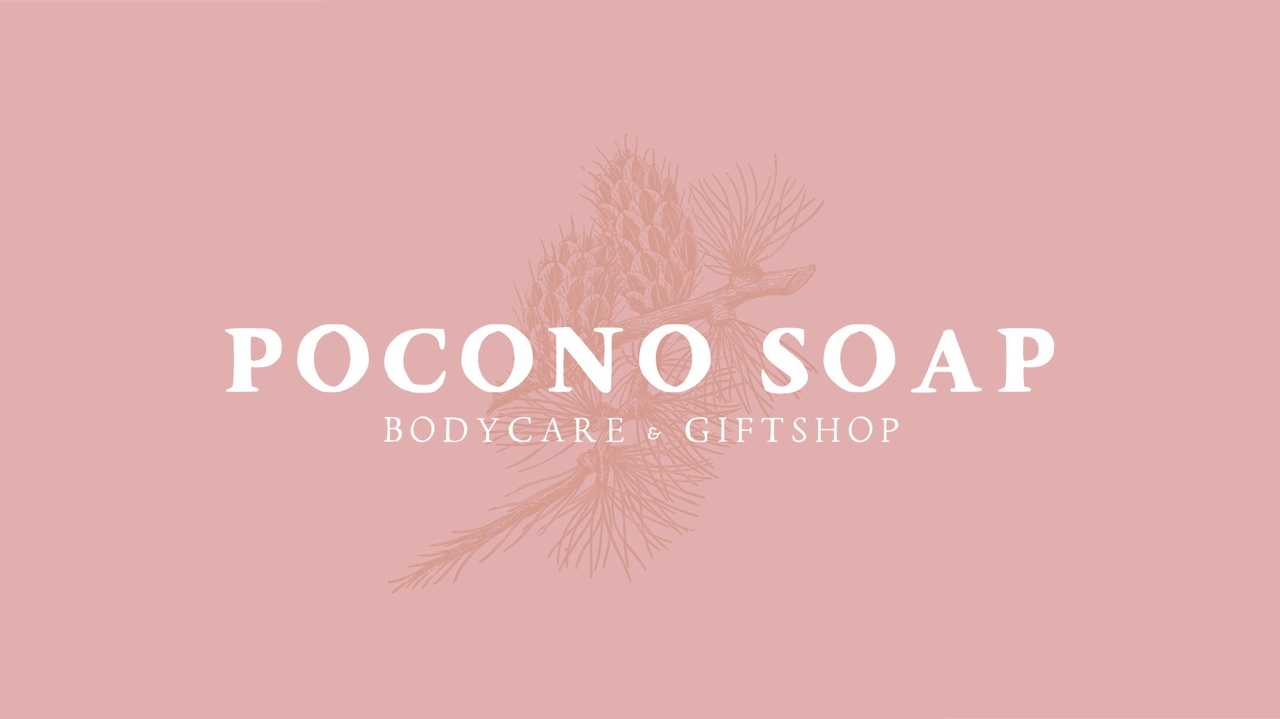


A flourishing business in the Poconos is expanding - and required a fresh brand to complement their growth. The goals of this design were to revise Pocono Soap’s existing logo in a way that would still be recognizable and endearing to their existing customer base, while updating their look to appeal to a new market.
For this design, I tried to reflect the feel of the Poconos area in the fall - it’s a beautiful area during this season. The palette reflects the warm colors of fall, the pine motif reflects the forests in the Poconos area. The font is similar to their existing font used, but has an elevated, but approachable, aesthetic.
Next Up: Pocono Soap E-Commerce site, under construction.